The before & after of the landing page & search page were very different. As I explained before, the navigation through the landing page was so confusing & was not clear.
That is why I offered a better solution to have clear navigation so users could find easily what they needed.
Hero image
A brief explanation of what Plan Fit offers.
CTA Buttons
Give to the new users a priority to register for the services & give another space for trainers.
Plan Fit Description
Give the user information about who we are and how the web app works.
Categories of sports
Show the different sports that they offer. *some sports that are repeated because Plan Fit group was in the process of defining which other sports they wanted to offer.
Benefits
Build engagement with the users & trainers.
Plans
Offer to the users a basic and premium plan where users can choose what works better for them.
Contact
A form where trainers & users can register to be a part of Plan Fit.
Social Media
Build engagement with the users & trainers.
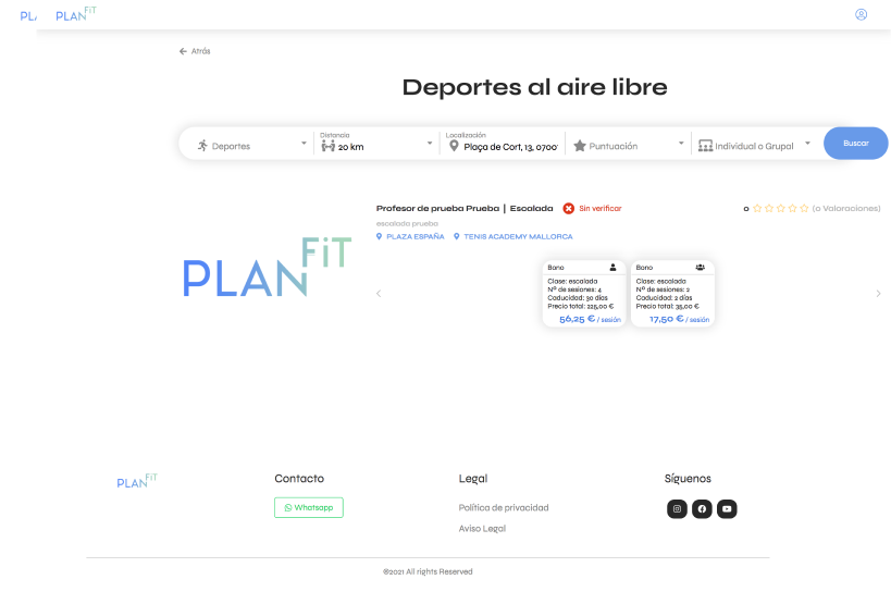
Search bar
Reorganizing the order of searching sports through location, sport, distance & individual or group activity.
Results
After using the filters on the search bar, users can find the number of results of sports they can have according to their needs.
More results
More options of activities they can keep browsing.
Social Media
Build engagement with the users & trainers.